Booths that work
as hard as you do.
Five case studies across healthcare, technology, and industrial sectors. Each one starts with a real problem and ends with a measurable result.
† Qualified conversation increase reported by Medovia and Nova Care vs. prior year exhibit.
Clearvia
Your data, finally clear.
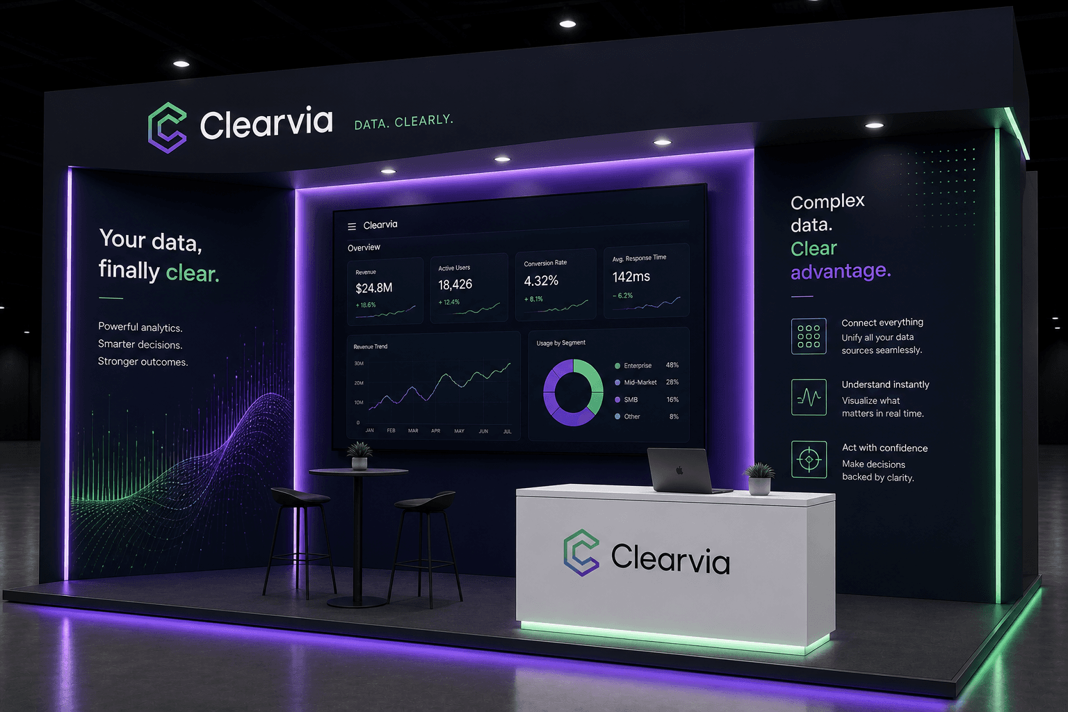
Clearvia competed in a category crowded with legacy BI vendors who all looked the same — blue gradients, stock chart imagery, enterprise beige. They had a genuinely differentiated product built around real-time clarity, but nothing in their prior exhibit communicated that. The booth felt like every other analytics company on the floor.
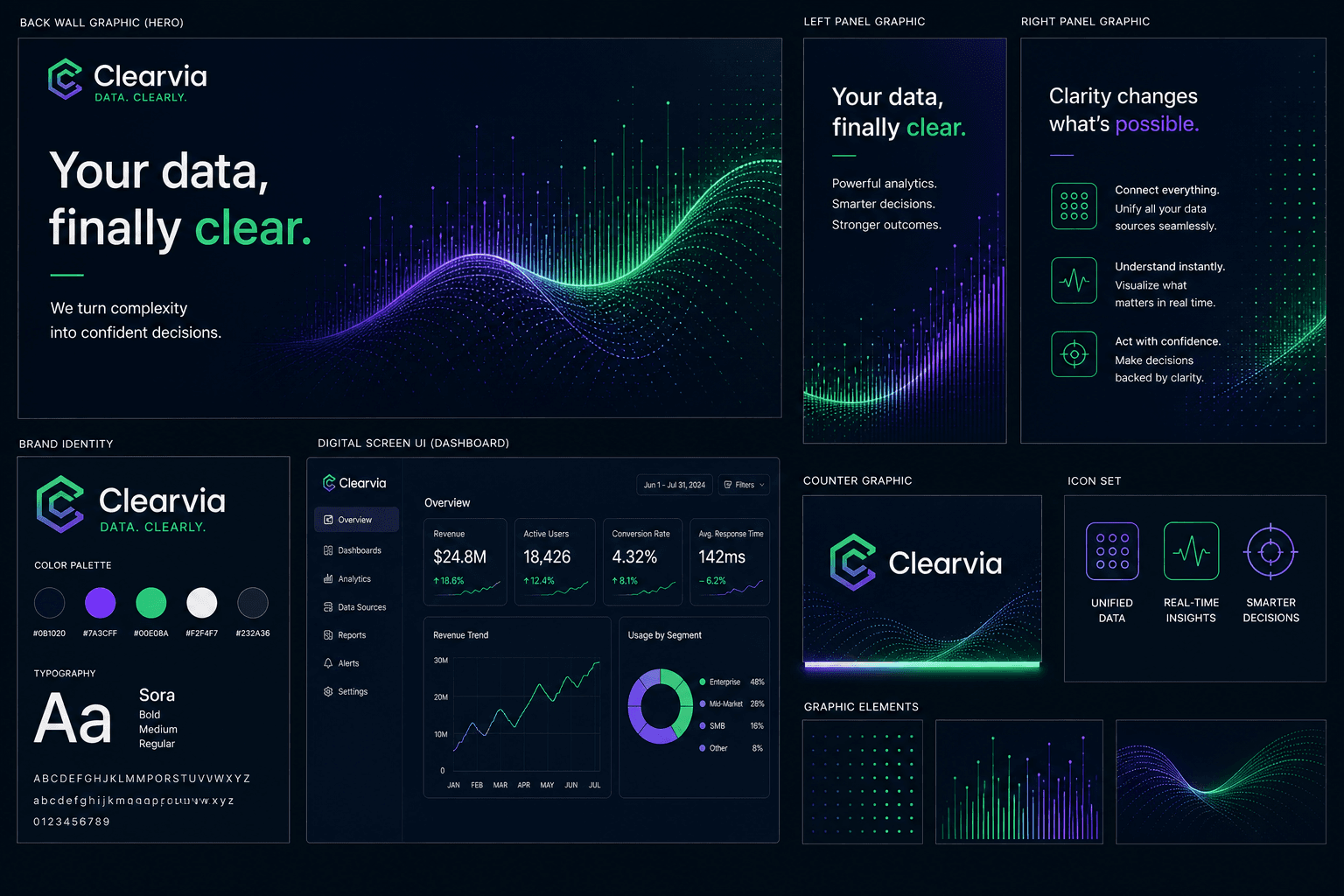
We stripped out every visual cliché and built the booth around the one thing Clearvia's platform actually does: make complex data legible at a glance. The centerpiece became a live, full-scale digital dashboard — real product metrics displayed at booth scale — so attendees could see the software working before a single sales conversation started. The messaging paired with it on the left panel: "Your data, finally clear." On the right, "Complex data. Clear advantage." Two panels. One story.
Most data booths default to white. We went full dark — deep navy with electric green and purple LED ambient lighting running along the floor and ceiling. On a bright show floor, the contrast stopped traffic. The darkness also made the live dashboard on the back wall pop with the visual intensity of a mission control screen.
Instead of a lifestyle photo or a generic graphic, the centerpiece of the back wall was a real product dashboard showing actual metrics — 18,426 active users, 4.32% conversion, 142ms response time. This wasn't decoration. It was a proof point. Attendees could read and react to it before any sales rep said a word.
The Sora typeface and green gradient wave system from Clearvia's brand identity were re-engineered for exhibit scale — the wave graphic that looks like a subtle texture on a screen reads as a bold, directional element at 10 feet tall. The counter used a clean white branded finish to ground the space and give sales staff a natural home base.
“Powerful analytics. Smarter decisions. Stronger outcomes.”
Medovia
The right diagnosis. Right now.
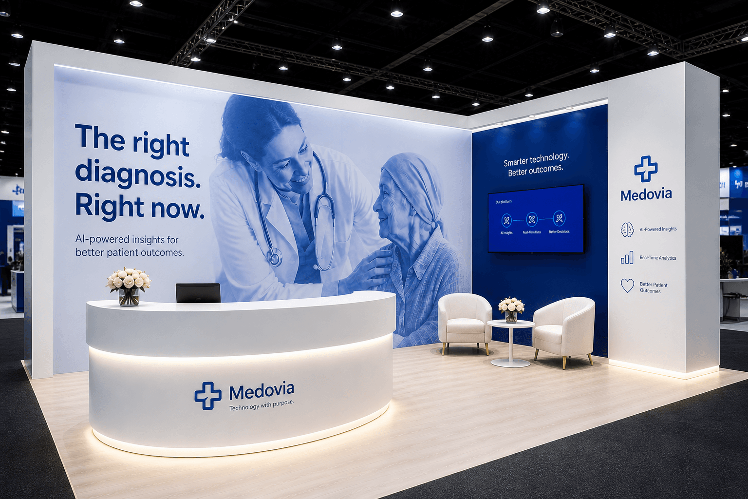
HIMSS is the most competitive healthcare technology show in North America. Medovia had a compelling AI diagnostics product, but their previous exhibit looked like every other health-tech vendor — too corporate, too cold, too feature-focused. They needed a booth that built immediate trust with clinical buyers while clearly communicating that this was a technology company, not a traditional medical device vendor.
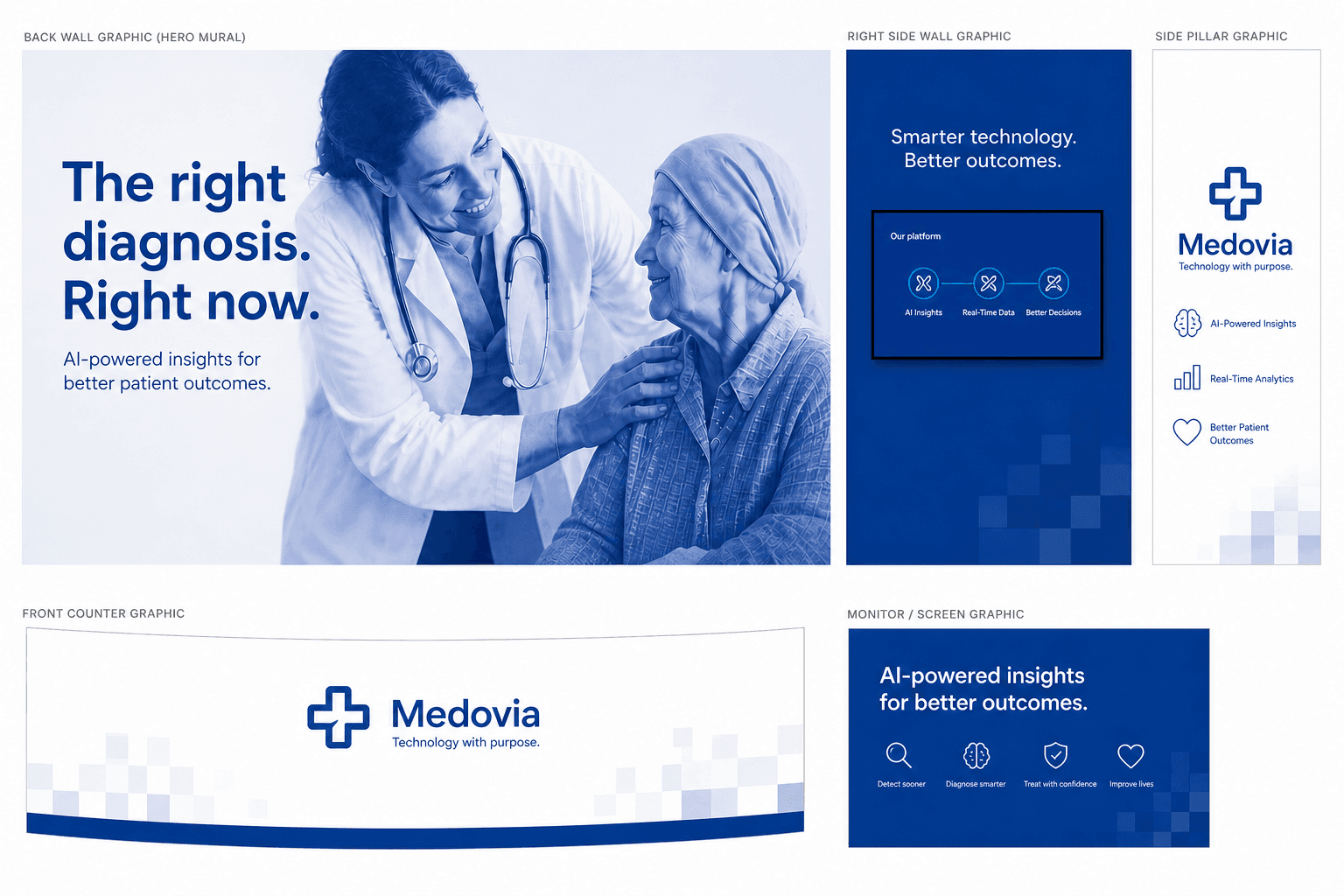
The central design tension in healthcare technology is this: clinical buyers need to trust you before they'll engage, but tech buyers need to see capability. We resolved it by leading with humanity and backing it with proof. The hero backwall is a full-bleed photograph of a physician with a patient — warm, real, emotionally resonant — paired with a headline that makes a direct clinical promise: "The right diagnosis. Right now." The right side of the booth handled the technology story: a live screen showing the platform interface, three clear benefit callouts, and the Medovia brand mark at height.
Rather than leading with a product screenshot or an abstract graphic, the entire back wall became a single photograph of a doctor and patient. At HIMSS, where clinical buyers walk miles of vendor booths, this stopped people who recognized their own world in the image. The headline — eight words — answered the question every clinician has in every patient encounter.
The curved white reception counter with under-lighting was not just aesthetic — it created a natural approach path for attendees and gave the booth a hospitality feel at the entry point. In a category where most booths have hard-edged tables, the curve signalled approachability. The Medovia logo on the counter face meant the brand was visible from aisle-level even when the booth was crowded.
Two white upholstered chairs and a round side table with flowers in the right corner created a private meeting space without walling it off. Clinical decision-makers — department heads, CMOs, procurement leads — do not want to have a 15-minute conversation standing up at a demo station. The lounge gave sales staff a place to move qualified prospects into a deeper conversation without leaving the booth.
“AI-powered insights for better patient outcomes.”
Nova Care
Better care starts with real connection.
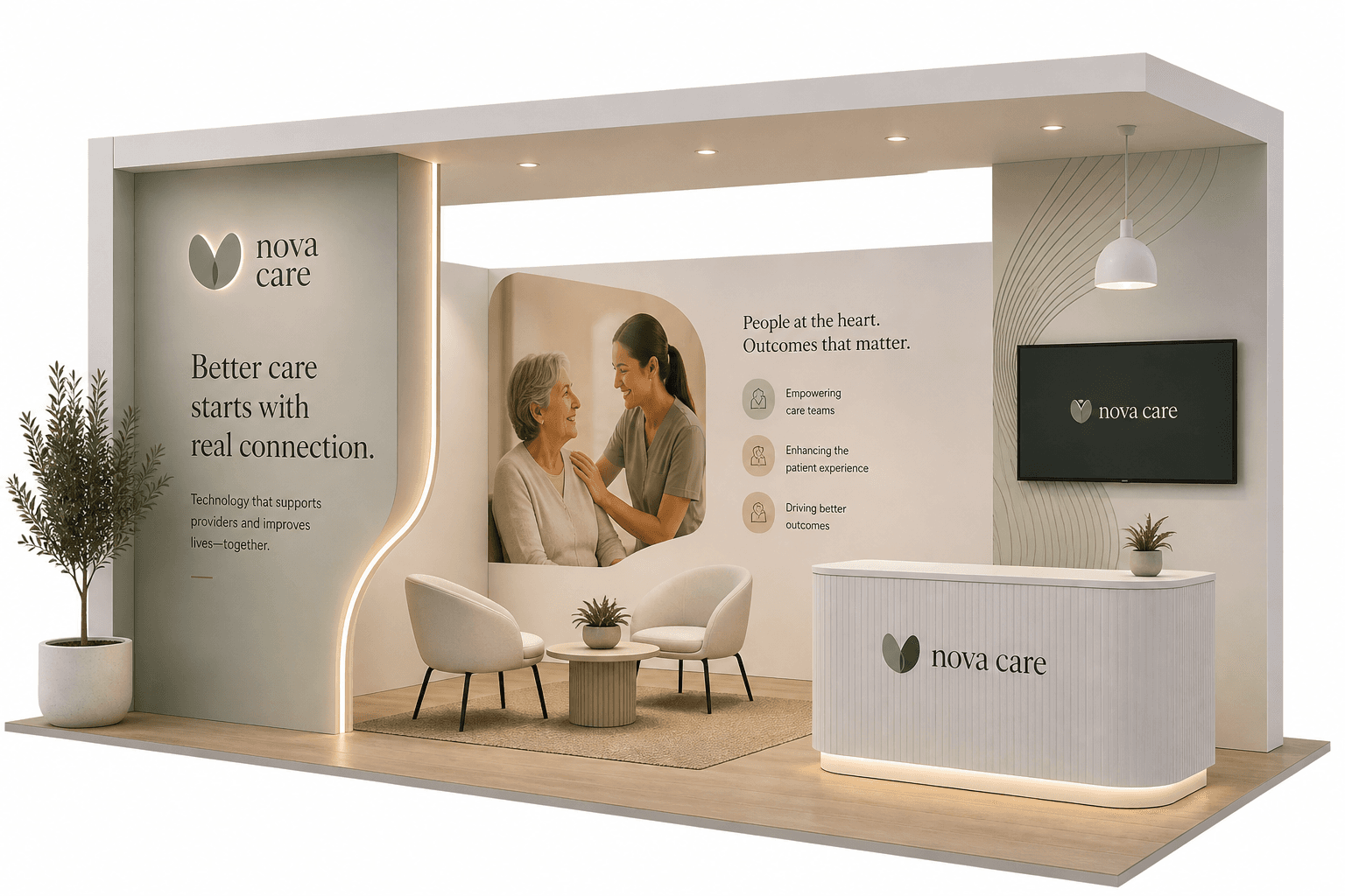
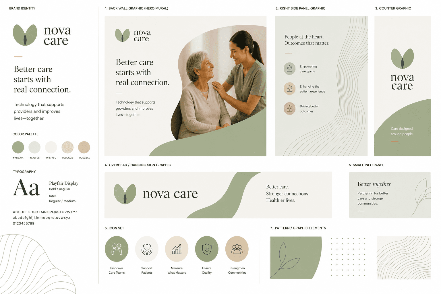
Nova Care provides technology that supports home care providers and their clients — a business that lives and dies on trust. Their previous exhibit communicated software features. It did not communicate the human dimension of what they actually do. At a conference where buyers are care coordinators, directors of nursing, and family services administrators, feature lists don't close deals. Relationships do.
We designed the booth as an extension of Nova Care's care philosophy rather than a product showcase. The question we asked at the start of the brief: if you walked into this booth, would you feel cared for? Every material, every layout decision, every piece of copy was tested against that standard. Warm wood-tone flooring, pendant lighting, live plants, and two curved lounge chairs made the space feel like somewhere you'd want to stay. The headline — "Better care starts with real connection" — worked because it described the booth as much as the product.
Most healthcare tech booths are white and corporate. Nova Care's booth used warm, natural materials — wood-tone flooring, organic shapes, soft lighting — that immediately read as human rather than clinical. The pendant light above the lounge area is a detail you'd find in someone's home, not a hospital. That choice was deliberate: Nova Care's clients are in people's homes. The booth should feel like it belongs there.
The hero panel showed a caregiver with an elderly patient — a real, warm moment. This was the emotional anchor of the booth. On the right side, a digital screen carried the technology proof points: "People at the heart. Outcomes that matter." and five pillars including community care, caregiver support, and family outcomes. Story first, capability second.
Nova Care's sage green brand palette — developed alongside the exhibit graphics — translated beautifully at booth scale. The botanical leaf logo and nature-inspired pattern elements from the brand graphics sheet ran as subtle textures on the booth panels, creating visual cohesion between what attendees saw on the floor and what they'd later see on a website, a leave-behind, or a business card.
“Technology that supports providers and improves lives — together.”
Conectp
Build faster. Ship smarter.
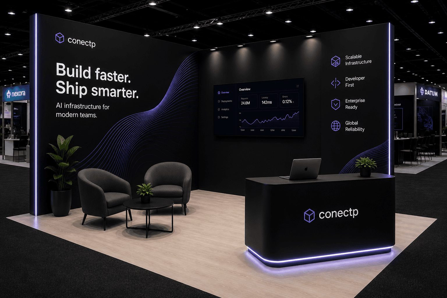
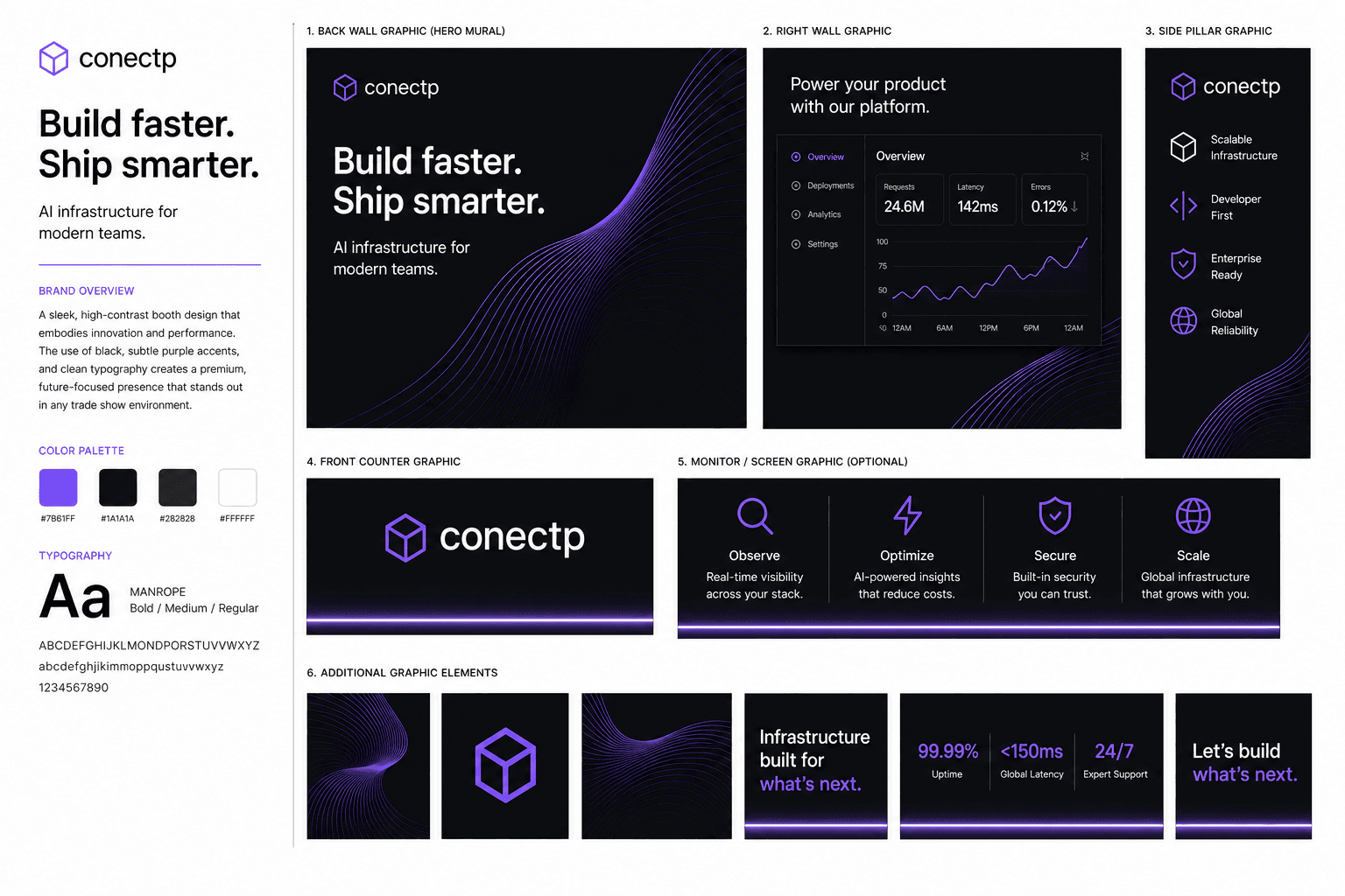
KubeCon is a developer conference. The audience — platform engineers, DevOps leads, CTOs of technical companies — can smell corporate marketing from fifty feet. Conectp had a genuinely powerful AI infrastructure product and a team that spoke the audience's language perfectly. The problem: their exhibit looked like it was designed for a corporate IT buyer, not a technical audience. Polished, professional, and completely wrong for the room.
We threw out the brief and started with the audience. What does a developer-first booth look like? Not bright. Not loud. Not full of marketing copy. We built the Conectp booth around a single, confident statement — "Build faster. Ship smarter." — and stripped everything else back. Dark environment, minimal decoration, a live data dashboard showing real platform metrics, and a lounge space that felt like a war room rather than a vendor pitch. The booth said: we are a serious infrastructure company. Come talk to us if you are too.
The booth used black carpet, a near-black backwall with a flowing blue-purple particle wave, and a sleek illuminated black counter. On a show floor of lighter, brighter booths, the darkness created immediate visual contrast and signalled confidence. Developer-first audiences are pattern-matchers — a dark, minimal exhibit is a shorthand for "this company knows what it's doing." Conectp earned credibility before anyone read a word.
The right-side screen showed live platform stats: 24M observations, 143ms optimization, 99.99% security uptime, global scale. These weren't cherry-picked marketing numbers — they were operational proof points displayed in a dashboard UI that looked exactly like the product. The right pillar carried four capability pillars: Scalable Infrastructure, Developer First, Enterprise Ready, Global Reliability. No stock photography. No lifestyle imagery. Just proof.
Two dark armchairs and a coffee table were placed center-booth — not tucked away, but in the main sightline. At a technical conference, the best conversations happen when both parties can sit down, open a laptop, and get into specifics. The lounge wasn't aesthetic filler. It was a signal that Conectp wanted the deep conversation, not the five-minute pitch.
“AI infrastructure for modern teams.”
Rowland
Built for land. Automations that work.
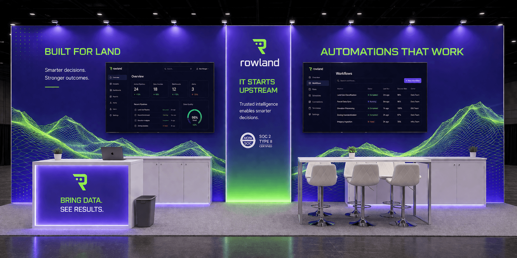
Rowland operates at the intersection of land management and industrial automation — a space where most technology vendors show up with generic enterprise software booths that could belong to any industry. Their clients — land managers, energy operators, and field teams — are practical, skeptical of hype, and deeply familiar with how hard their environment actually is. Rowland needed a booth that felt like it was built for the industry, not just placed in it.
The brief was clear: show authority. Rowland wasn't looking for leads from people who'd never heard of them — they were looking to deepen relationships with existing industry contacts and establish dominance in a field where they were already a serious player. We designed a 20×30 island that divided its story across three distinct panels: "Built for Land" on the left with live operational dashboards, "IT STARTS UPSTREAM" in the centre establishing the brand's core philosophy, and "AUTOMATIONS THAT WORK" on the right with platform proof points. Three statements. One complete argument.
The signature visual element across all three panels was a green neon topographic data wave — part landscape, part data feed — that ran continuously behind the content. In land and resource industries, the land itself is the product. The visualization tied Rowland's technology back to the physical environment it operates in. It also made the booth unmistakable — nothing else on the floor looked like it.
Both the left and right panels featured large-format dashboard screens showing real operational data — field workflows, decision trees, automation outputs. These weren't conceptual mockups. They were screenshots of the actual Rowland platform at a scale where industry buyers could immediately recognise the interface and understand what they were looking at. The tagline on the left panel — "Smarter decisions. Stronger outcomes." — paid off what the data behind it proved.
The center island featured bar-height white stools and a work-surface counter — not lounge chairs. At a land industry conference, the people Rowland needed to talk to don't linger in soft seating. Bar height keeps conversations upright, efficient, and movable. The "BRING DATA. SEE RESULTS." counter on the far left — anchored by a large Rowland "R" logo — gave the sales team a natural command position in the booth.
“Trusted intelligence enables smarter decisions — from the field up.”
Ready to build something that works?
Not sure where to start? Book a free 15-minute call and we'll scope it out together. Or submit your brief directly and get three concepts within 24 hours.
No pitch. No pressure. Just a conversation about your show.